In the bustling world of finance, where numbers dictate narratives and decisions can hinge on the blink of an eye, the ability to translate raw data into actionable insights is nothing short of a superpower.
Enter Power BI, the wizard’s wand in data visualization. In this blog, we embark on an exciting journey into selecting appropriate visualizations for financial data using the magical canvas of Power BI.
Picture this: a vast expanse of financial data stretching as far as the eye can see. Investments, expenses, and revenues — are all intertwined in a complex tapestry. Navigating this landscape requires more than spreadsheets and formulas; it demands a visual language that can decipher the intricacies and communicate a compelling story.
Bar Charts: Erecting Pillars of Financial Wisdom
Bar charts stand tall as the architectural pillars of financial visualisation. Whether portraying quarterly revenue growth, comparing expenses across departments, or highlighting market share, bar charts deliver a visual narrative that resonates with financial enthusiasts and decision-makers alike.
Example: Quarterly Revenue Comparison
In Power BI, crafting a bar chart is as intuitive as a brushstroke. The platform allows you to effortlessly select your dataset, drag and drop variables into the visual elements, and voilà — a dynamic bar chart emerges, showcasing the rise and fall of financial metrics over time.
Line Charts: Tracing the Financial Symphony
Line charts take centre stage when the story revolves around trends, patterns, and the evolution of financial landscapes. Power BI’s wizardry empowers users to create interactive line charts that dynamically trace the trajectory of stocks, depict revenue growth, or unravel the intricacies of financial performance over time.
Example: Stock Price Trends Over a Year
With Power BI, users can harness the power of line charts to reveal trends and fluctuations in stock prices. The platform allows seamless customisation, enabling users to add trend lines, annotations, and interactive features that transform financial data into a dynamic symphony.
Pie Charts: Slicing Through Financial Complexity
While debated for their usage, pie charts find their niche in financial data when the focus is on proportions and composition. Power BI’s pie chart capabilities empower users to slice through complex budget allocations, delineate expense categories, and provide a visual feast of financial compositions.
Example: Expense Breakdown for a Quarter
Creating a pie chart in Power BI involves a few clicks, allowing users to effortlessly visualise expense breakdowns. The platform’s interactivity ensures stakeholders can hover over each segment to uncover specific details, turning a static chart into a dynamic exploration.
Scatter Plots: Navigating Financial Relationships
When it comes to deciphering relationships between two variables, Power BI’s scatter plots take centre stage. Whether exploring the correlation between risk and return or visualising the interplay between sales and marketing spend, scatter plots in Power BI provide a visual canvas for uncovering nuanced insights from financial data.
Example: Relationship Between Advertising Spend and Sales
In Power BI, users can seamlessly construct scatter plots that map the intricate relationship between advertising spend and sales. The platform’s intuitive interface allows for customisation, enabling users to add trend lines, tooltips, and other interactive features that elevate the scatter plot into a dynamic exploration.
As we navigate the financial landscape armed with Power BI’s visual toolkit, it becomes evident that this platform is not merely a tool; it’s a maestro orchestrating a symphony of financial insights. Bar charts, line charts, pie charts, and scatter plots are not just visuals; they are the notes that compose a musical narrative, transforming financial data into a captivating story.
Power BI emerges as the enchanted brush, allowing financial analysts, decision-makers, and enthusiasts to paint vivid pictures of financial scenarios. With its user-friendly interface, dynamic capabilities, and extensive visualisation options, Power BI transcends the boundaries of data analysis, turning numbers into a visual masterpiece that guides businesses toward informed
decisions and financial success.
So, let the visual symphony play on — where data becomes art, and financial insights become a harmonious journey through the captivating world of finance, all under the magical spell of Power BI.
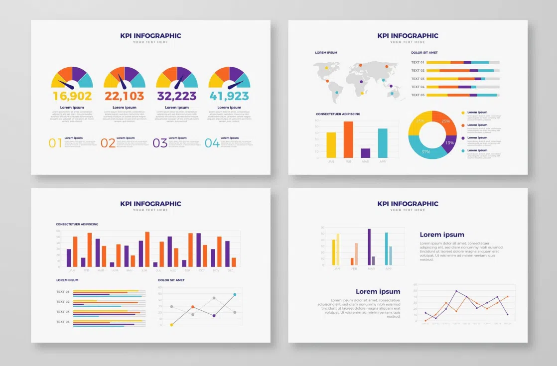
And I know that what’s a write-up on visuals when there are no visuals? Right? So, I am providing a guidebook on Ultimate Guide to Power BI – FP&A (Financial Planning & Analysis), which covers a crucial topic – Power BI’s Exceptional Financial Dashboards and their advantages.
Here, you can study this visual presentation and understand its benefits to suit your organisation’s success.
Click to download: Ultimate Guide to Power BI
Start Your Finance Transformation Journey With
One Simple Step!